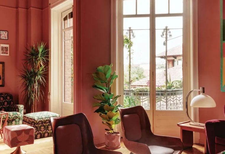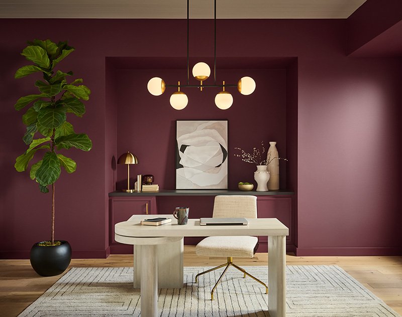
Standing in a paint store with sixty shade cards fanned out in your hand is its own special kind of stress. You want your living room to feel current, not like it’s stuck in 2019 beige purgatory — but you also don’t want to repaint again in eighteen months because you panic-bought a trend that didn’t age well. Fair worry. Interior paint color trends for 2026 are, thankfully, a bit more forgiving than the stark all-white or all-grey phases we’ve been through. This year leans warm, a little moody, and — dare I say — more personal.
I’ve spent a good chunk of the last few months reading through what the big paint brands are pushing, and also just watching what’s actually going up on walls in homes I’ve visited or worked with. Those two things don’t always match. So this isn’t a straight rundown of marketing decks. It’s what I think is genuinely worth your paint budget this year, and what I’d politely skip.
What’s Driving Interior Paint Color Trends in 2026
Short answer: comfort, texture, and a retreat from stark minimalism. Homeowners are picking paint color trends that feel lived-in and warm rather than showroom-perfect — think worn book pages, not glossy magazine spreads.
A few years back, everything was about clean lines and cool greys — the whole “resale value neutral” approach. That’s fading. Design forecasters this year keep circling back to words like quiet luxury, tactility, and slowness. Benjamin Moore’s Color of the Year, Silhouette, is a deep, umber-charcoal blend that leans traditional and a bit poetic. PPG’s forecast talks about jewel tones paired with stone neutrals. Sherwin-Williams went sandy and khaki-toned with Honest Essentials.
Closer to home, Asian Paints named “Moonlit Silk” as its Colour of the Year — a warm, luminous neutral they describe as inspired by the feel of worn book pages and everyday rituals. That framing tells you a lot about where the industry’s head is at: less about looking expensive, more about feeling settled.
I’ve noticed this shift show up in real conversations too. Clients who two years ago wanted “safe grey for resale” are now asking for warmth, depth, even a bit of drama in one room. That’s a genuine change in mood, not just marketing spin.
Warm Neutrals Are Replacing Cool Greys
Direct answer: In 2026, warm neutrals like greige, mushroom, taupe, and soft khaki are taking over from the cool, flat greys that dominated the last decade. They pair better with wood tones and natural textures, and they photograph far more inviting under warm lighting.
This is probably the biggest, least controversial shift happening right now. Builders and homeowners alike are moving away from icy “greystone” type shades toward warmer versions with brown or taupe undertones. It’s a subtle change on paper but a big one in person — walk into a room painted in a warm greige versus a cool grey and the temperature difference (visually, not literally) is obvious.
A few specific directions I’m seeing repeated across brands:
- Mushroom and stone tones — muted, slightly dusty, work beautifully with brass or wood fittings
- Sandy khaki — Sherwin-Williams’ Universal Khaki is a good example, pairs well with natural fiber rugs and rattan furniture
- Soft taupe with a hint of pink or brown — less clinical than the grey we’ve had for years
For Indian homes specifically, warm neutrals genuinely make sense with the amount of natural light most rooms get. A cool grey can look flat and almost sad under harsh afternoon sun; a warm greige holds up much better and doesn’t fight with wooden furniture or jaali work.
[link to related guide on choosing undertones for Indian light conditions here]
Moody, Saturated Colors Are Having a Real Moment
Not every room needs to be neutral anymore, and that’s honestly refreshing. Deep, saturated colors — think plum, forest green, burnt umber, even near-black — are being used confidently on accent walls and, increasingly, on entire rooms.
PPG’s 2026 palette leans into what they call jewel-toned opulence, mixed with stone neutrals to keep it grounded. Benjamin Moore’s Silhouette itself is a burnt umber and charcoal blend — dark, but not cold. I actually like this trend a lot, more than I expected to. A single wall in deep plum or bottle green does something a flat white wall just can’t: it gives a small room a sense of intention.
Picture a small home office in a 1BHK in Jaipur — maybe 90 square feet, one window, a desk pushed against the wall. Paint three walls a soft warm white and the fourth in a deep forest green, and suddenly that cramped little room reads as designed, not just leftover space. That’s the kind of trick I’d actually recommend trying.
A word of caution though: go too dark in a room with poor ventilation or very little natural light, and it can feel closed-in rather than cozy. Test a sample patch first. Always.
Statement Ceilings Are No Longer Just a Trend Piece
Direct answer: Painting the ceiling a color instead of standard white is one of the fastest-growing interior paint color trends for 2026, adding a “fifth wall” effect that makes rooms feel more finished without needing new furniture or decor.
I’ll admit I was skeptical of this one initially — a colored ceiling always struck me as something that looks great in a design magazine and terrible in an actual low-ceilinged apartment. But I’ve changed my mind after seeing it done in a few homes with 9 to 10 foot ceilings. Done right, it doesn’t lower the room; it frames it.
Some ways this is showing up:
- Matching the ceiling to the wall color in a slightly lighter tint for a cocooning effect
- A soft sky blue or pale sage ceiling in bedrooms — subtle, not overwhelming
- High-gloss white ceilings paired with deeply saturated walls for contrast
If your ceiling height is under 9 feet, though, I’d genuinely think twice. A dark or bold ceiling in a low room can make it feel like it’s pressing down on you. This is one trend where the room’s actual dimensions should overrule what’s trending.
Nature-Inspired Greens and Earthy Tones
Green isn’t new, exactly, but the specific greens people are reaching for have shifted. We’re past the bright sage-everywhere phase and into deeper, muddier greens — olive, moss, forest, sometimes almost black-green.
This ties into a broader “biophilic” push across the industry — a fancy way of saying people want their homes to feel connected to the outdoors, especially after years of more screen time and less green space. Newer forecasts specifically call out increased use of plaster effects and limewash finishes alongside these earthy palettes, which makes sense; a flat, glossy green doesn’t read as natural the way a slightly textured, matte one does.
For Indian homes, olive and moss tones work particularly well in dining rooms and studies. They’re forgiving of dust and daily wear too, which matters if you’ve got kids or pets running through the house.
Pastel Blues and Soft Blush Are Coming Back, Quietly
Remember the barely-there pastel blue everyone painted their nursery around 2013? It’s back, but grown up a bit. Design writers are calling it “misty blue” — enough depth that it doesn’t read as a baby’s room anymore, more like a considered, calm neutral-adjacent color.
Soft blush pinks are following a similar path. Not the bubblegum pink of a decade ago — dustier, more muted, closer to a warm greige than an actual pink in some lightings.
Where I’d use these:
- Misty blue — bedrooms, home offices, anywhere you want a calming effect without going full grey
- Dusty blush — powder rooms, reading nooks, small accent spaces rather than entire large rooms
Has this ever happened to you — you paint a pastel thinking it’ll feel soft and end up with something that reads as childish under your specific lighting? Test swatches at different times of day before committing. Pastels shift dramatically between morning and evening light, more than darker colors do.
Color Drenching: One Color, Every Surface
Color drenching — painting the walls, trim, ceiling, and sometimes even doors all in the same shade — has moved from niche design blogs into fairly mainstream use this year. The effect is a room that feels enveloping rather than boxed in by contrasting trim lines.
I have mixed feelings here, honestly. Done in a mid-tone or lighter shade, it can look genuinely stunning and makes small, oddly-shaped rooms feel more cohesive. Done in a very dark, saturated color across every surface of a small room with low ceilings, it can feel like stepping into a cave. One interior painter friend of mine described it as “brave, but not for everyone,” and I think that’s about right.
If you want to try it without fully committing, start with a small guest bathroom or a powder room — spaces where you can be more experimental since you’re not living in them all day.
Regional Note: What This Looks Like in Indian Homes
Global paint forecasts are useful, but they’re built around homes with central heating, muted daylight, and, frankly, different budgets. A few adjustments worth keeping in mind if you’re painting in India this year.
Asian Paints’ own 2026 forecast, ColourNext, leans into similar warm-neutral, slow-living themes as the global brands, but frames them specifically around Indian homes and rituals rather than importing a Western palette wholesale. That’s worth paying attention to over generic international trend lists.
- Strong, direct sunlight in most Indian cities means darker or cooler colors can read very differently than in a mock-up photo shot in cloudier climates
- Humidity in coastal cities like Mumbai or Chennai affects how matte versus glossy finishes hold up over time
- Budget-wise, a full-room repaint in a premium emulsion from a brand like Asian Paints or Berger typically runs somewhere in the ₹18–₹35 per square foot range for labor and paint combined, though this varies a lot by city and finish
[link to related guide on paint finish types for humid climates here]
FAQ: Interior Paint Color Trends 2026
What is the most popular interior paint color for 2026? There isn’t one single answer, but warm neutrals — greige, mushroom, sandy khaki — are the most broadly popular across brands right now, alongside deeper jewel tones for accent walls.
Are grey walls out of style in 2026? Cool, flat grey is fading as the default “safe” choice, yes. Warmer versions with brown or taupe undertones are taking its place, though grey itself isn’t disappearing entirely.
Is it a good idea to paint my ceiling a color? If your ceiling is at least 9 feet high and gets decent natural light, yes, it can work really well. In lower or darker rooms, stick with a soft white or very pale tint instead.
What paint finish is trending for 2026? Matte and low-sheen finishes are still preferred for walls, especially with the limewash and plaster-effect textures showing up in several forecasts this year. Trim and doors are still often semi-gloss for durability.
Do I need to repaint my whole house to follow these trends? No, and I’d actually advise against it. Pick one or two rooms — a bedroom, a study, maybe a powder room — and experiment there first. Trends shift; your whole-house repaint budget shouldn’t have to shift with them every year.
How do I know if a trending color will suit my home’s lighting? Buy a sample pot before committing to gallons. Paint a patch on at least two different walls and check it morning, afternoon, and evening. Indian daylight especially can shift a color’s undertone quite a bit between 10 AM and 6 PM.
Final Thoughts
If there’s one thread running through interior paint color trends for 2026, it’s a move away from playing it safe. Warm neutrals instead of flat grey, moody accent walls instead of all-white everything, ceilings that actually get some attention for once. None of it demands you repaint your entire home to keep up — that’s not realistic, and honestly it’s not good advice either.
Pick the one room in your house that’s bothered you the most this year. Try a sample pot of a warm greige or a deep olive green there first. See how it feels for a week before you commit to gallons. That’s really the only way to know if a trend is right for your specific walls and your specific light — not a swatch on a screen.